Bambusa: Packaging Design
Bambusa Nutritech: Reviving traditional methods to deliver premium cooking oils and foodstuffs, with versatile, scalable packaging designs for discerning audiences in Malaysia, Singapore, and the Middle East.
Objectives
International Demography
A packaging design that will convert across different demographics but will also sit well in the local market.
Establish Nativity
The brand takes great pride in hailing from Tamil Nadu and the packaging visually should embody the same.
Minimal & Premium
The packaging had to reflect both nativities, luxury, and premium-ness at the same time as the products were of a higher price point.
Scalable master graphic
The current art direction will form the base for all upcoming products (rice, spices, etc). Hence the design must be scalable.
Opportunity Areas
After multiple visits to the store and online research of competitors for the brand, a set of clear directions for the art direction of the packaging was derived. Bambusa oil’s opportunity area lies in exploring a unique color palette, different from the competitors.
Bambusa oil’s opportunity area lies in exploring a unique color palette, different from the competitors.
Handpainted elements can provide a premium feeling and emphasize the quality as well as the hand-made feature.
People know when and how to use oils, they are recurring buyers, so there is no need to add the raw material photo or the end product photo/ illustration.
Packaging Design Process
Competitor Analysis:
Intense competitor analysis and multiple store visits in UAE and in India helped understand how the existing products were packaged and designed.
Infusing Nativity :
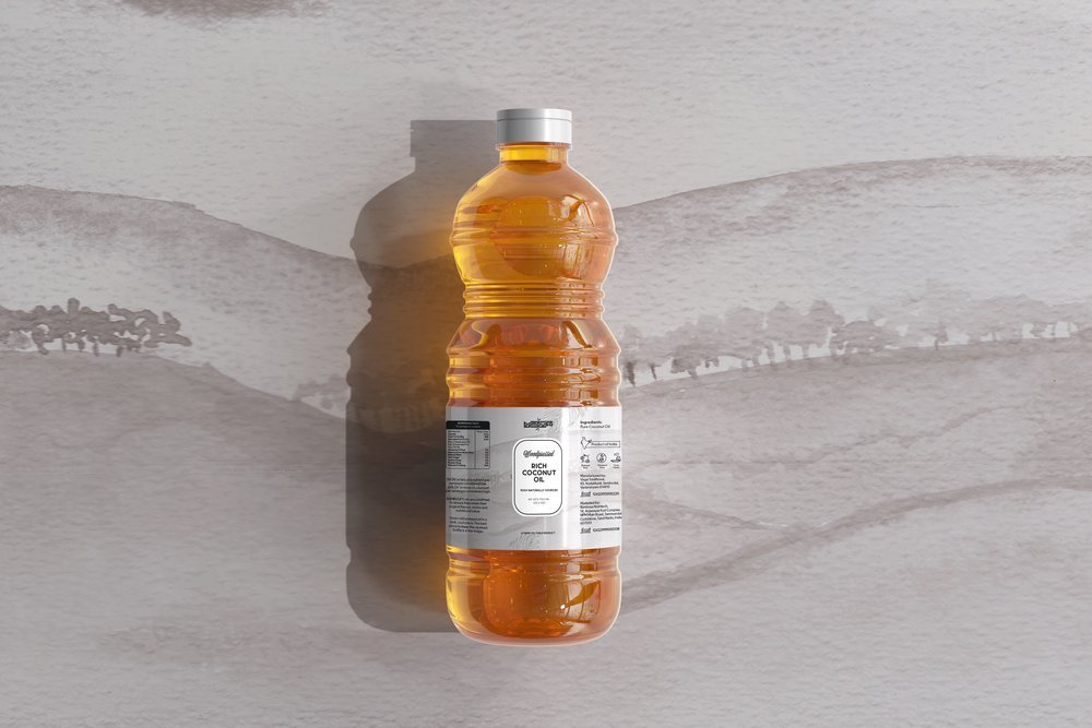
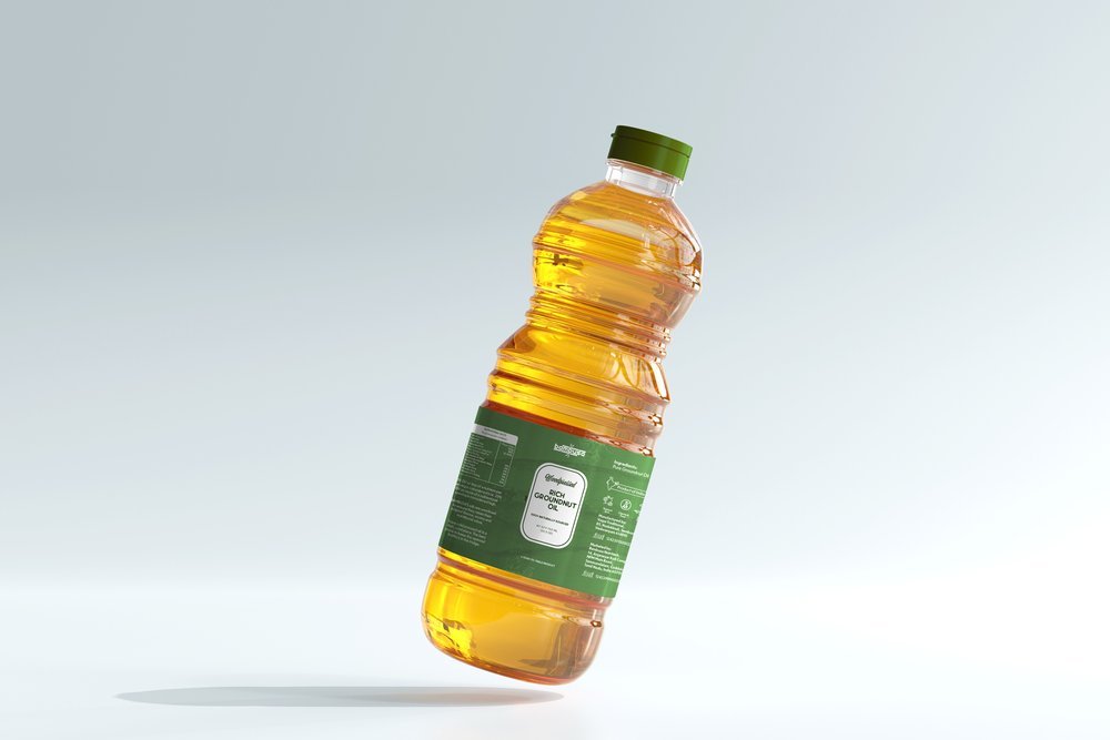
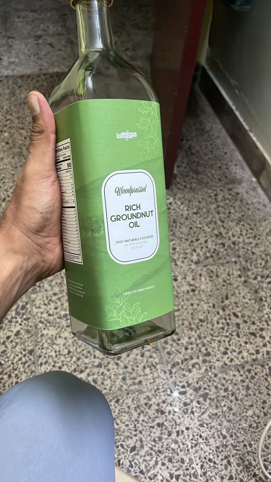
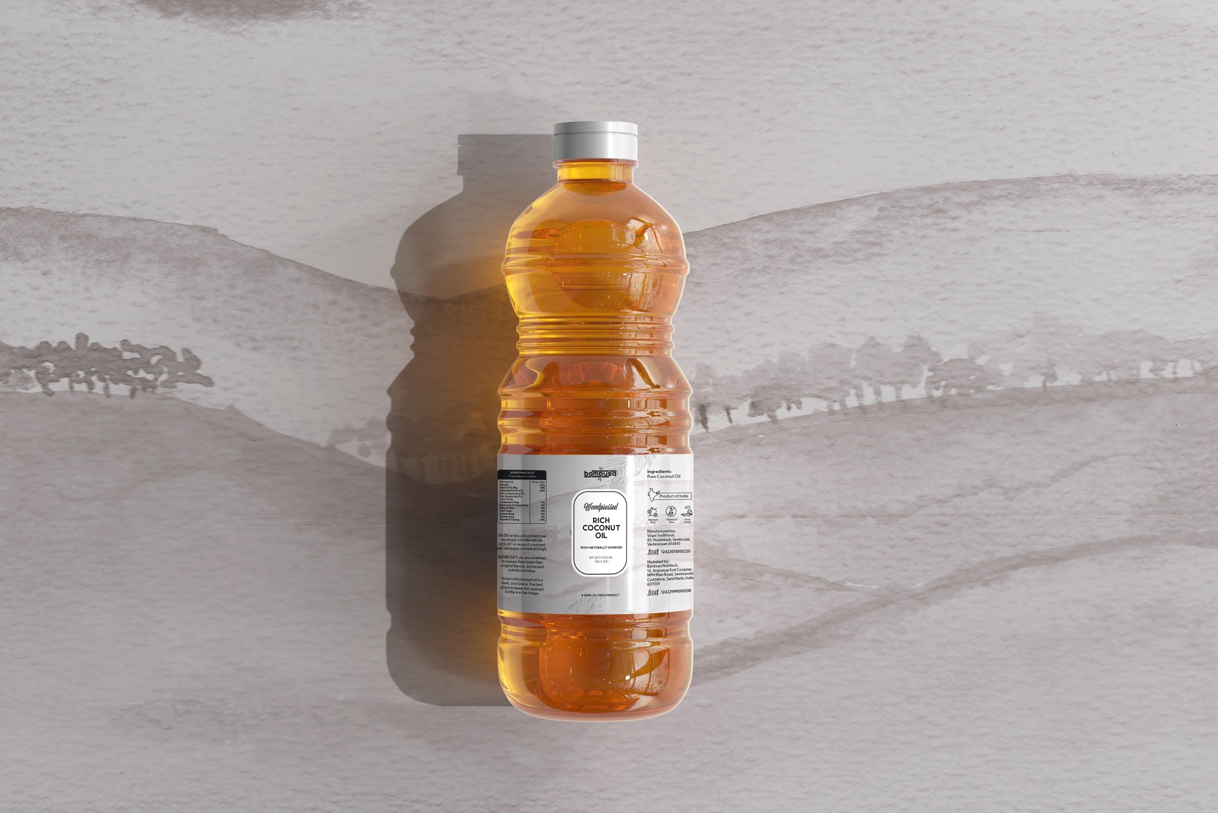
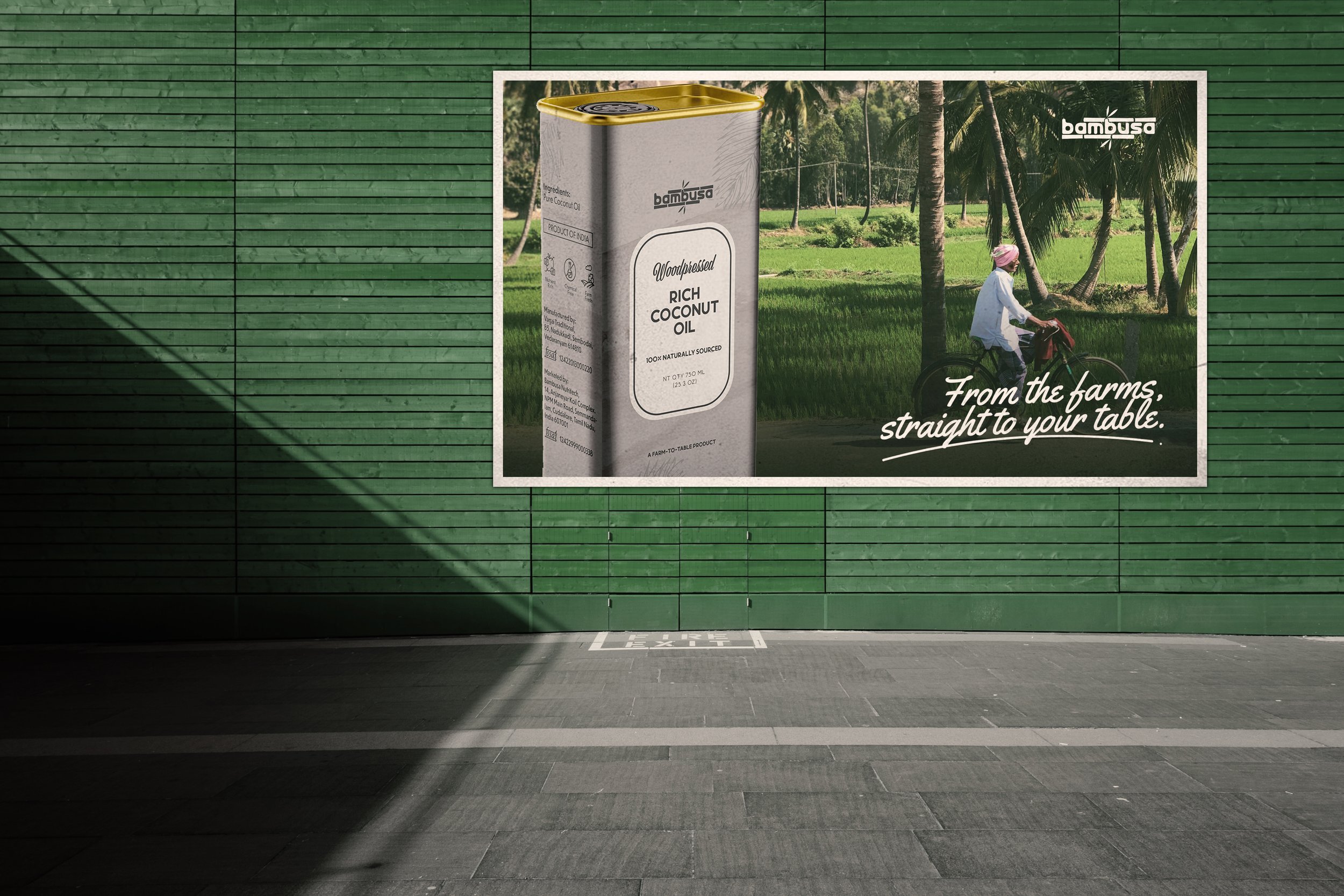
As it was important to highlight elements of Tamil Nadu in the packaging, I worked on a background that showed a farm, among hills and trees, trying to replicate an image that was shot on one of my research trips.
Information Architecture:
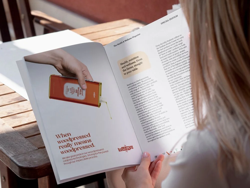
In a highly populated shelf of oil products, it is important to capture and hold the reader’s eyes. The information architecture and visual hierarchy was tested on multiple focus groups to pick out the right one.
Unique Colour Palette:
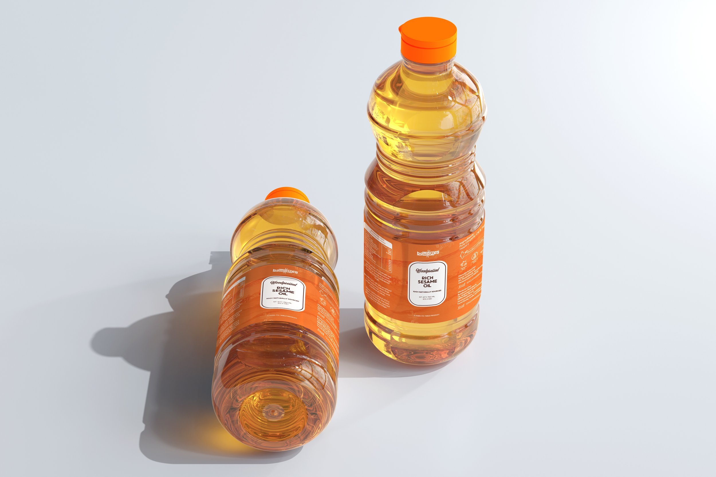
A color palette that is different from the competitors and also conveys that the product belongs to a premium price range was developed- Orange, Green and Grey.
Conclusion
The packaging design project for Bambusa Nutritech successfully met the challenge of appealing to an international demographic while maintaining a strong connection to its Tamil Nadu roots. The design effectively balanced the dual themes of nativity and premium luxury, reflecting the high quality and price point of the products. This was achieved through a unique color palette of Orange, Green, and Grey, setting Bambusa apart from its competitors and indicating its premium nature. Handpainted elements added to the premium feel, emphasizing the quality and artisanal aspect of the products.
The scalability of the design was a key consideration, as it needed to serve as a master graphic for a range of future products including rice and spices. Detailed competitor analysis and consumer research, including multiple store visits in the UAE and India, informed the design process. The incorporation of a farm scene background, inspired by a research trip, infused the essence of Tamil Nadu into the packaging. The careful crafting of information architecture ensured the products stood out on crowded shelves, capturing and retaining consumer attention. Overall, the project not only achieved its objectives but also positioned Bambusa Nutritech for success in diverse markets with its distinctive, culturally-rich, and premium packaging design.