Visual Branding: House of Moves
When movement studios were a rare sight in a city like Chennai, Raymond Callanan, a prominent dancer in town, conceptualised the idea of creating a movement arts studio. He christened the name House of Moves and reached out to me to help him with the visual branding of his studio.
Project Overview
The project involved developing a brand identity for a novel movement arts studio in Chennai, India. Given the concept's relative novelty in the region, a global competitor analysis was conducted, revealing a predominance of typography and icon-based identities in similar studios.
Design Concept and Inspiration
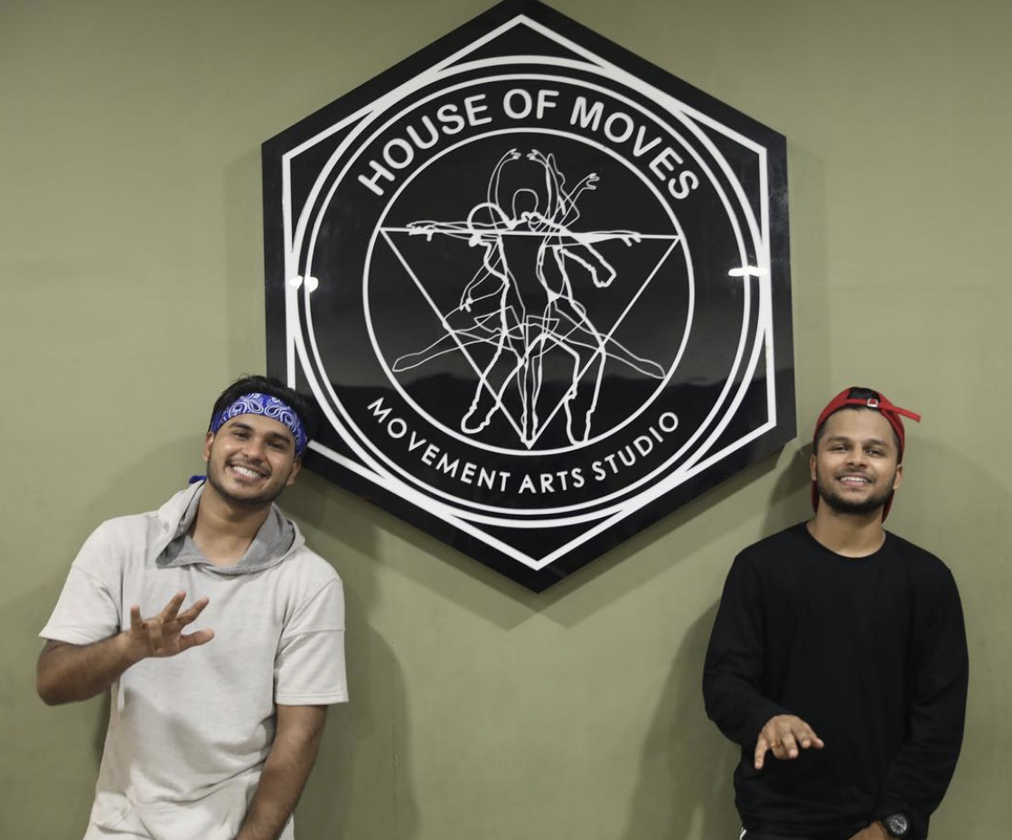
Striving to incorporate the 'arts' aspect into the brand identity, the decision was made to create a combination mark. The logo drew inspiration from Wassily Kandinsky's studies on movement, focusing on using dance movement silhouettes or outlines. The aim was to capture the art of movement within a defined space, symbolizing the studio environment.
Logo Development
A unique approach was taken by choosing a hexagon as the bounding box for the logo, a shape that allows for viewing movement from multiple perspectives. The design was further influenced by Da Vinci's Vitruvian Man, symbolizing human proportions. This led to the creation of a unique interpretation of the Vitruvian Man using a main hip hop dance silhouette, layered with other movement styles.
Type & Palette
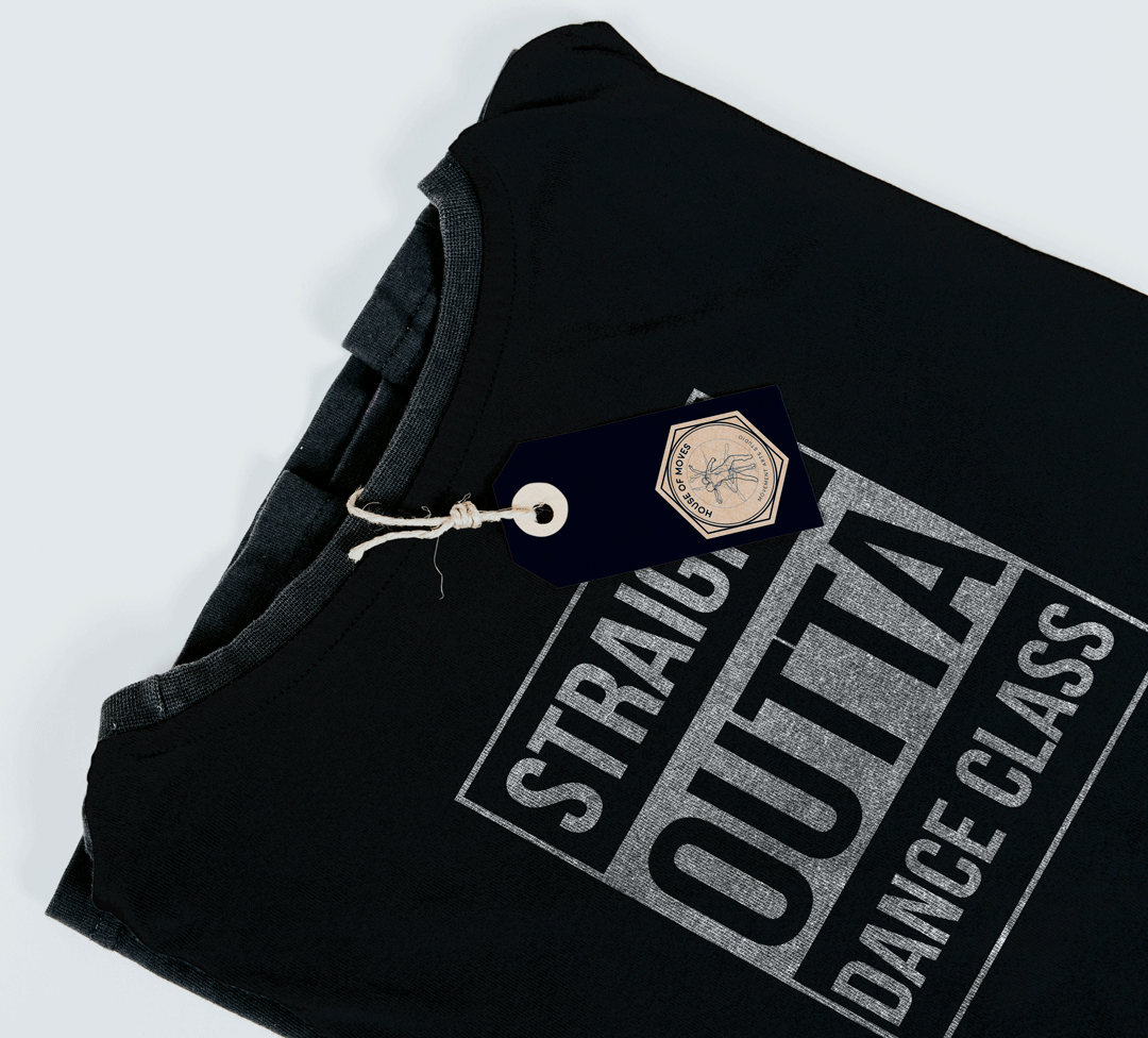
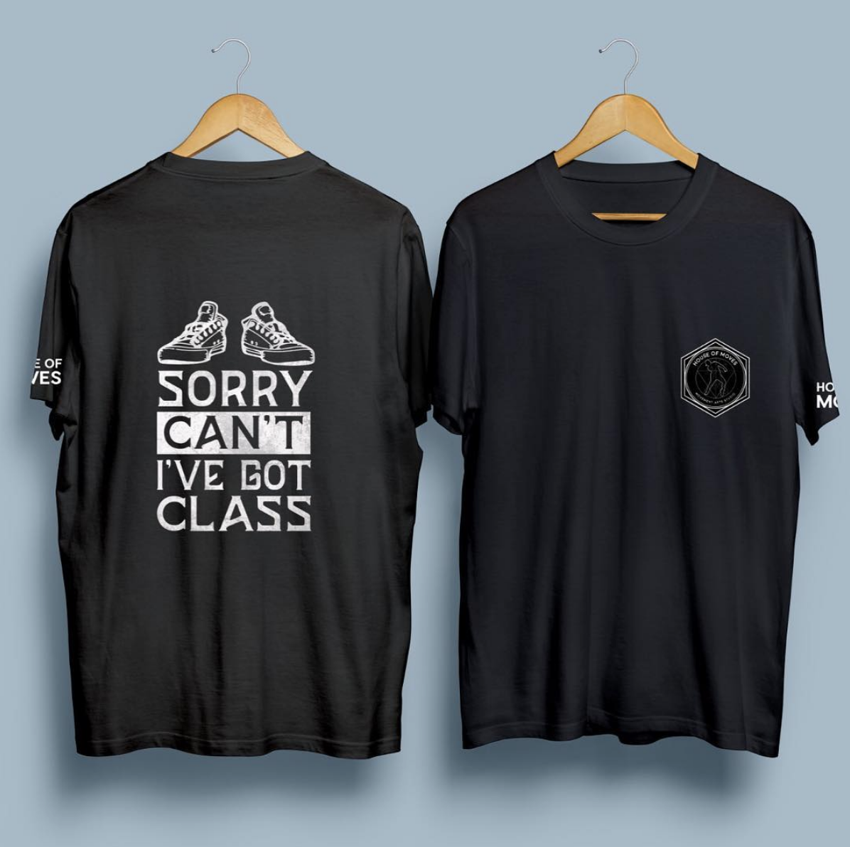
Despite the client's hip-hop background, the choice was to avoid brush lettering or graffiti-inspired fonts. Instead, 'Moon', a rounded sans serif open-source font, was selected. The color palette was kept simple and adaptable in basic black and white monochrome, symbolizing flexibility and activity.


Visual Style
The visual style of the brand blended street style with movement and elegance. The brand's visuals were movement-based, using colorful typography and graphics to convey a sense of constant motion.
Conclusion
This branding project successfully established a unique identity for the Movement Arts Studio, differentiating it in the Indian market and reflecting its dynamic and artistic nature. The choice of logo, typography, and color palette effectively communicated the studio's essence, striking a balance between movement, artistry, and accessibility.