Some More Foods: Millet Cookies
Healthy ≠ Boring. SomeMore Foods’ Millet Cookies add a twist to millet cookies with their quirky flavours. We added a twist to the packaging by making it fun- through the layout, colour palette and reimagined the process and placement of the product in the POS, disrupting the idea of healthy being boring. What if we made the process of handling the package itself fun? The project was nothing but FUNctional delight delivered through packaging design.
This project was awarded India’s Best Design Project Award 2022.
This was a project I worked on while working at Frozen Iris. Vignesh Arullingam helped me with compiling this expansive case study.
Objectives
Revamping the existing label design and adapting it to a box through disruptive design. Developing a packaging design that can cater to a wide range of audience from established buyers, millennials to the elderly while simultaneously conveying the uniqueneness of the cookies’ flavours.
Domestic and Global Audience
Designing a packaging that will be prominent and relevant when placed among both domestic and global markets.
Stand Out from the Competition
Developing a packaging design that stands out from other healthy snacking options thereby leading to more conversions.
Healthy & Fun
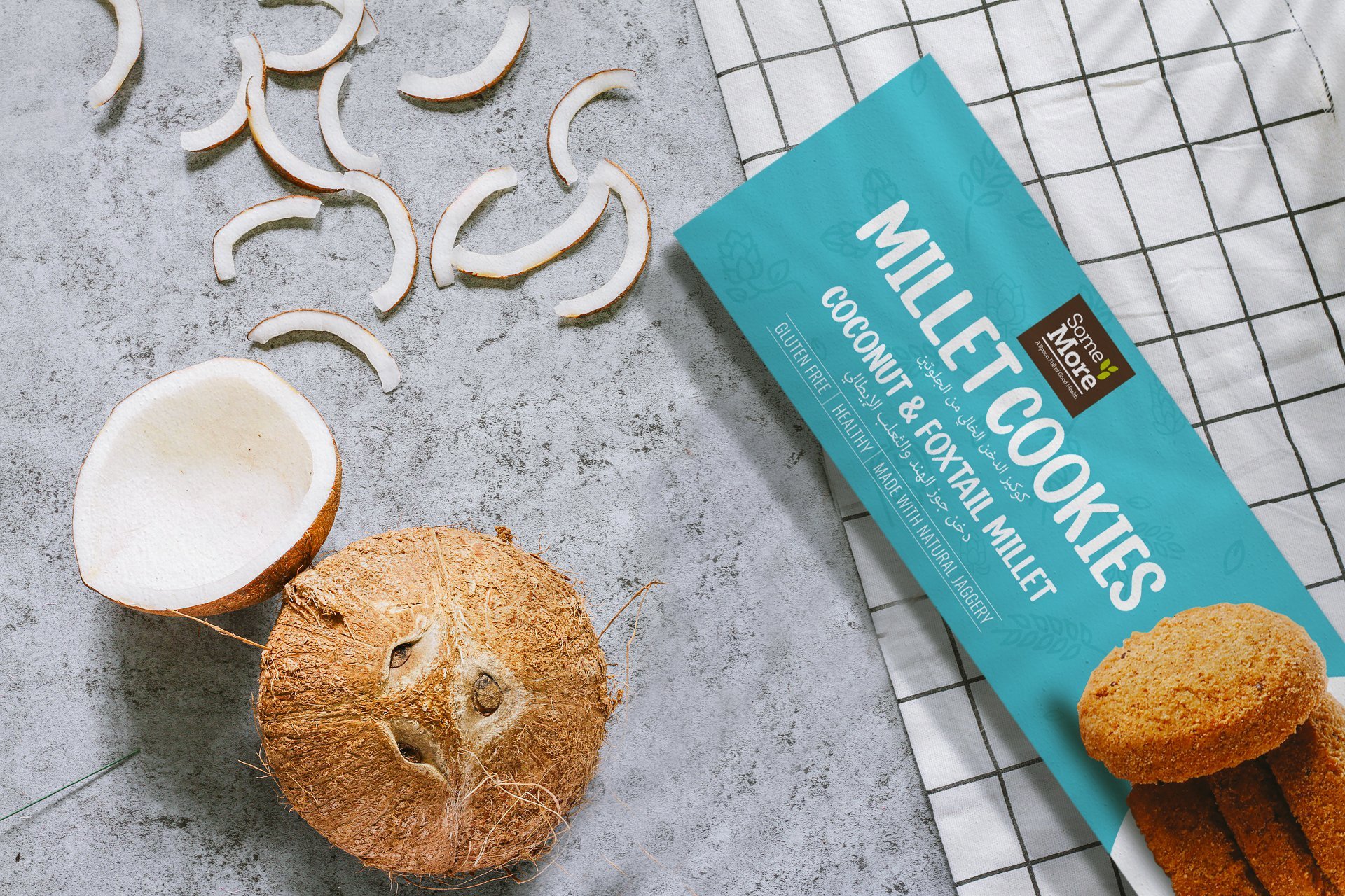
With the twist in flavours of the product, the packaging had to convey the same and highlight the clean ingredients and the health benefits through a delightful approach.
Unique Challenges
A intense competitor analysis carried out both online and in-stores helped understand what kinds of packaging are available in the market and how the millet cookies packaging can be better designed to increase conversion.
Highly Competitive Market
With the emphasis on health and wellness lately, it was a challenge to there place Some More Food’s Millet Cookies stand out from the plethora of brands that focus on healthy snacking.
Domestic and Global Audience
Packaging that works well for domestic markets need not necessarily work well for a global audience hence the packaging design needs to cater to both the demographics/ markets.
Highlighting the Flavours
We had to highlight the uniqueness of the combination of flavours, which is like no other product out there, in the best possible way through the packaging design.
Healthy and Fun
Healthy is not always fun, is it? But Cookies taste great. Adding a bit of fun to a healthy packaging transforms the way the snack is perceived- thereby leading to higher conversions.
Packaging Design Process
Research and Competitor Analysis
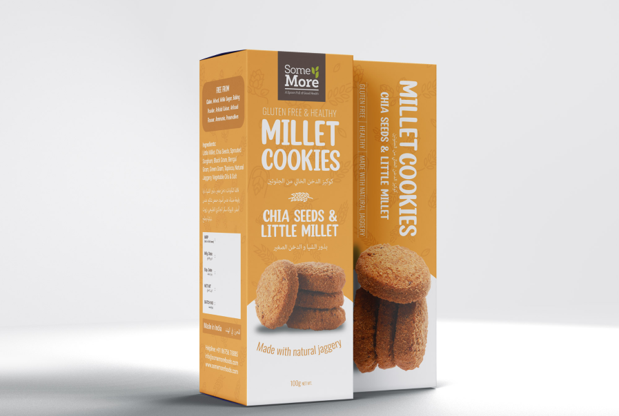
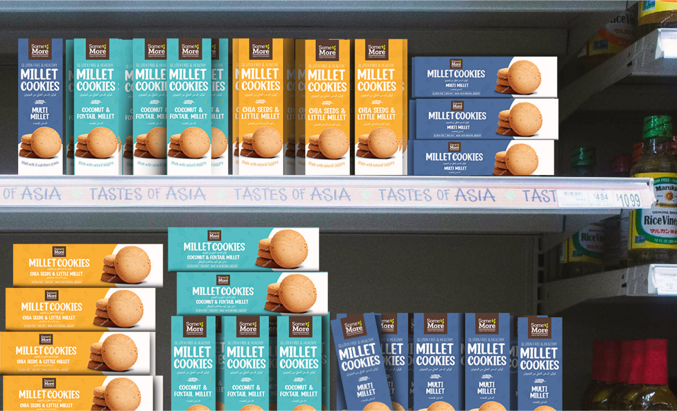
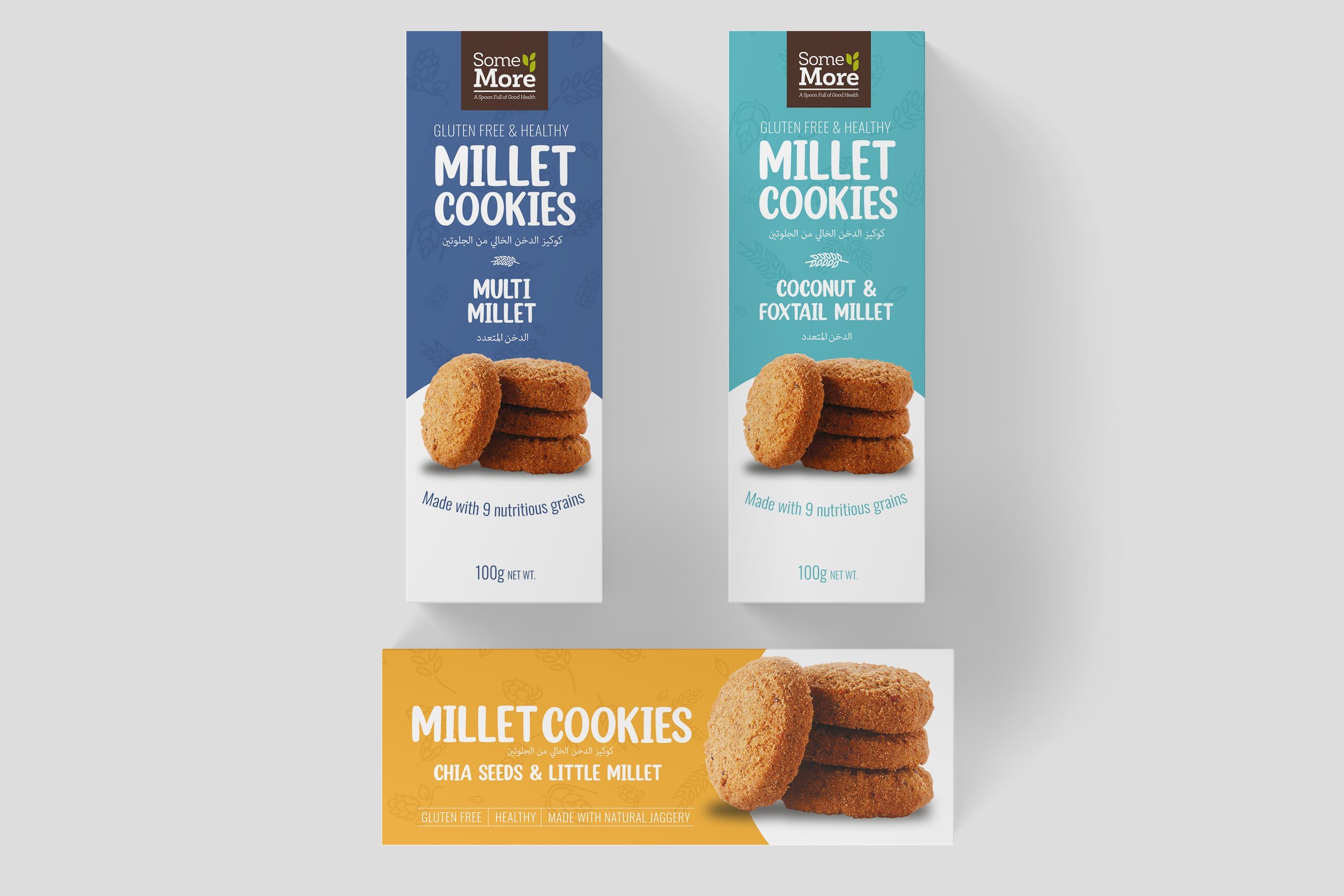
We started with multiple in-store visits and online crawling to analyse competitive brands and their packaging designs. We noticed a dominant trend in the use of red, blue and brown color for packaging design and the higher emphasis was given to the presence of the ‘organic’/champion ingredients.The competitor’s packaging design were usually horizontally placed on the box. A vertical box will be different stand out.
We discovered two different design directions, one focusing on the “homemade/organic’ essence and the second on providing a holistic fun experience.
Infusing ‘fun’ in the experience
On testing the design drafts, we realised that the approach that emphaisized ‘fun’ worked better for everyone- from our designer to the person stacking these boxes up in their store to the buyer who is thrilled to see a fresh approach.
How will a vertical box be stacked in the POS? We went ahead and combined a horizontal as well as vertical arrangement of the content. We imagined the process of displaying these boxes in the store and how much of a delight the person might have when they are getting creative with arranging the boxes!
Tailoring the visual style to suit the fun
A colour palette that is distinctive from the competitors and also evoking a sense of an edible freshness-
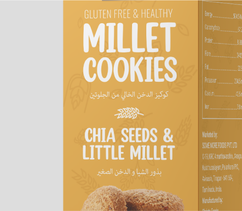
yellow: conveying the colour of the little millet.
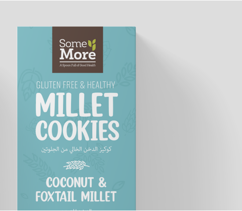
turquoise: colour for the coconut and foxtail millet to provide a tropical feeling of coconuts.
blue yonder: for the multi millet flavour.
We used a handwritten typography to emphasise the homemade quality of the cookies
Also we highlighted the ingredients along a smiling arc
to make everyone smile
Conclusion
I believe that packaging design is more than just a graphic element that covers the product- it is an experience in itself.
Through this project, I came up with the concept of making the packaging an exciting experience for everyone involved in the process of packaging, displaying to shopping. It can be quite overwhelming for the buyer to choose a product out of the many healthy options now available- SomeMore Food’s Millet Cookies packaging just simplifies the process and eases the decision making by conveying minimal and important information that is succint and relevant, through an exhilarating design.
Developing an unconventional colour palette to suit the unique flavours of the product, puts the product in the fore-front to the potential buyer. We also went a step ahead and made the packaging easy to be used across different marketing collaterals, including digital marketing, where visual appeal is a prime objective for increased conversions.