The Divine Foods
Refashioning Tradition: Packaging design and rebranding for a traditional food brand based out of Tamil Nadu, India.
Objectives
Packaging that appeals to a global audience
Opting for healthy and naturally derived alternatives has taken to become number one in our grocery lists all around the world. And The Divine Foods is making a mark in both the American as well as Indian markets with their traditional food. The packaging had to appeal to a global market.
Refashioning traditional foods
In the pandemic and post-pandemic world, there is growing emphasis laid on adding and consuming natural and organic food as part of our diet for holistic wellness. However, traditional food has a type of perception in our audience mind. The Divine Foods packaging had to break the monotony and deliver something new to the kitchen cabinets.
Repositioning the brand
The Divine Foods began making and selling turmeric and turmeric based products alone. The brand reached out to me, when they were diversifying their portfolio of products from turmeric-only products to traditional foods. This meant the project was both challenging and interesting.
Problems to Solve
Art direction and design that is scalable
Many products were to be added to the brand’s product portfolio and it was being continuously innovated with a new product being added to the roster each week.
Global Market
The product was to be placed in both American as well as India markets. The design had to appeal to both audience.
Expansive target group
The products’ target audience range from 8 years to 80 years old. This means, the design has to appeal to every age group. Which is quite a challenge.
Visual Enticement
The main POS for the products were through their website and Amazon. The brand’s marketing channel is primarily digital marketing. This meant that the packaging is required to be aesthetically pleasing as well as attractive in photos.
Design Process
Competitor analysis & research
There have been a lot of brands coming up in the natural and holistic wellness department in online stores and marketplaces.
They go for doodle-like illustrations and more of hand-written typography for their packaging.
Scalable art direction
Since the brand was set on expanding its range of products, it was important to establish an art direction, so that it is easier to expand to be applied in upcoming products that were innovated continually.
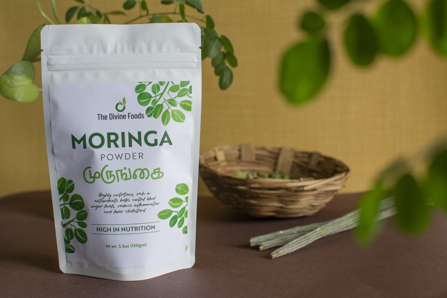
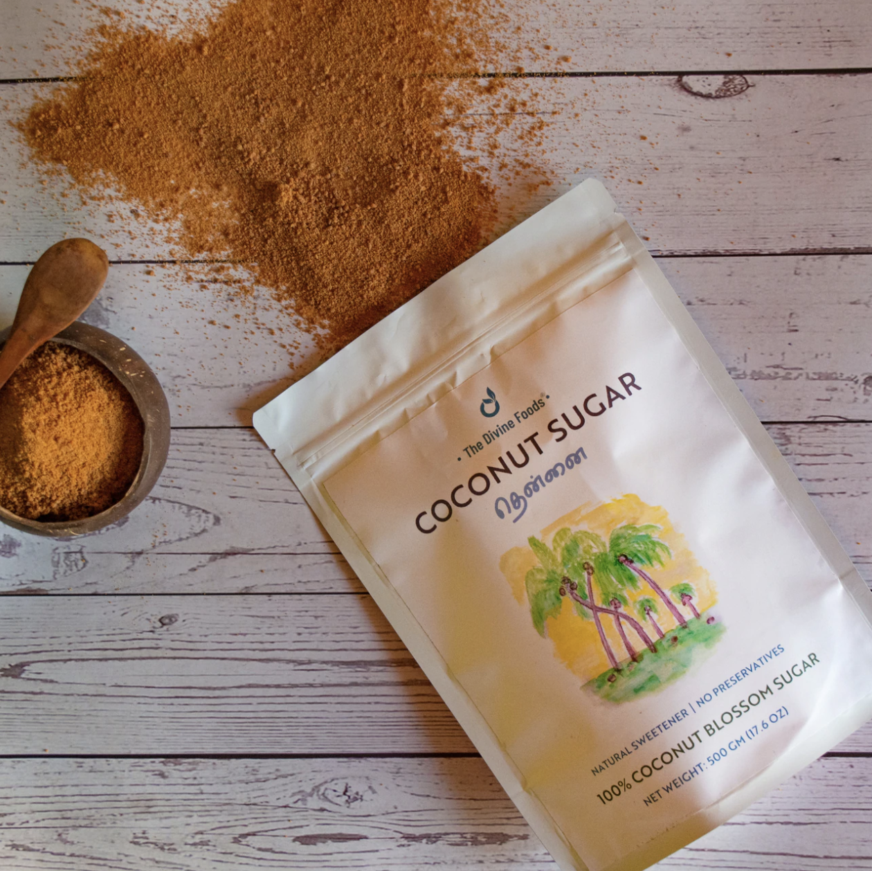
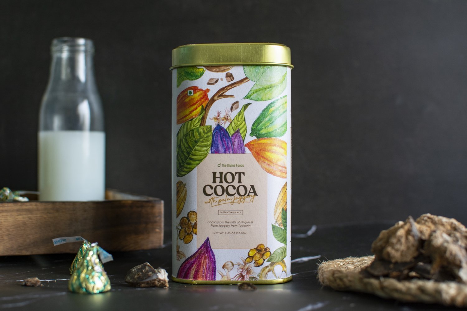
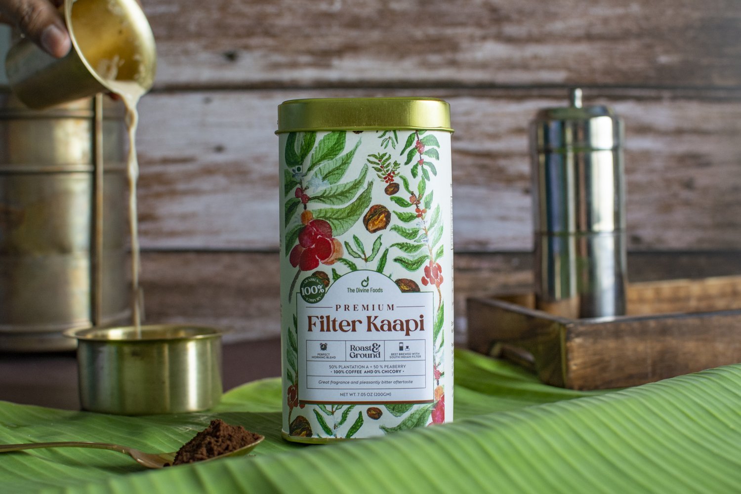
I realized that rather than using patterns or colors to differentiate the products, why not change the entire artwork in itself with every product to bring out a sense of personalization and hand-made touch?
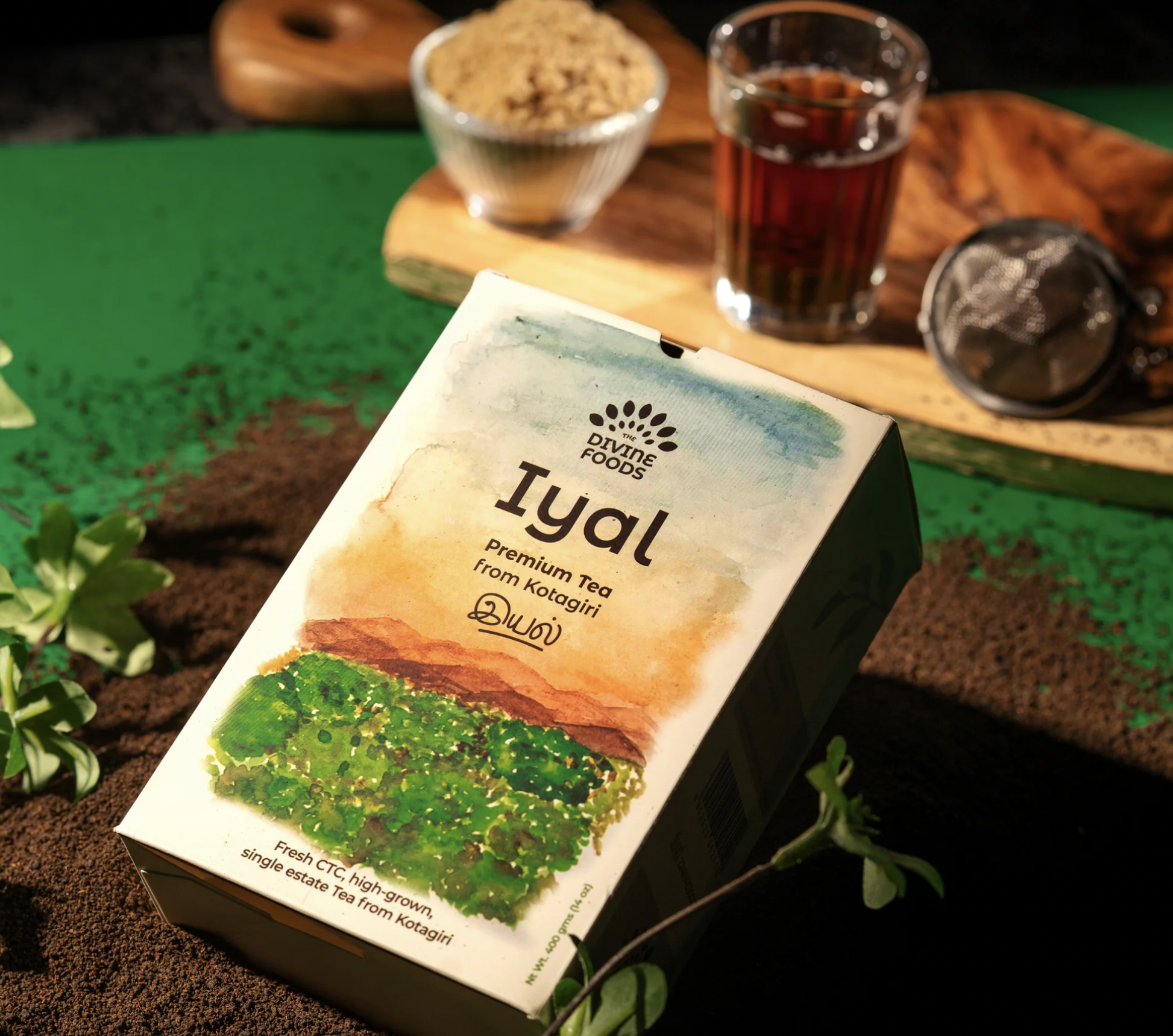
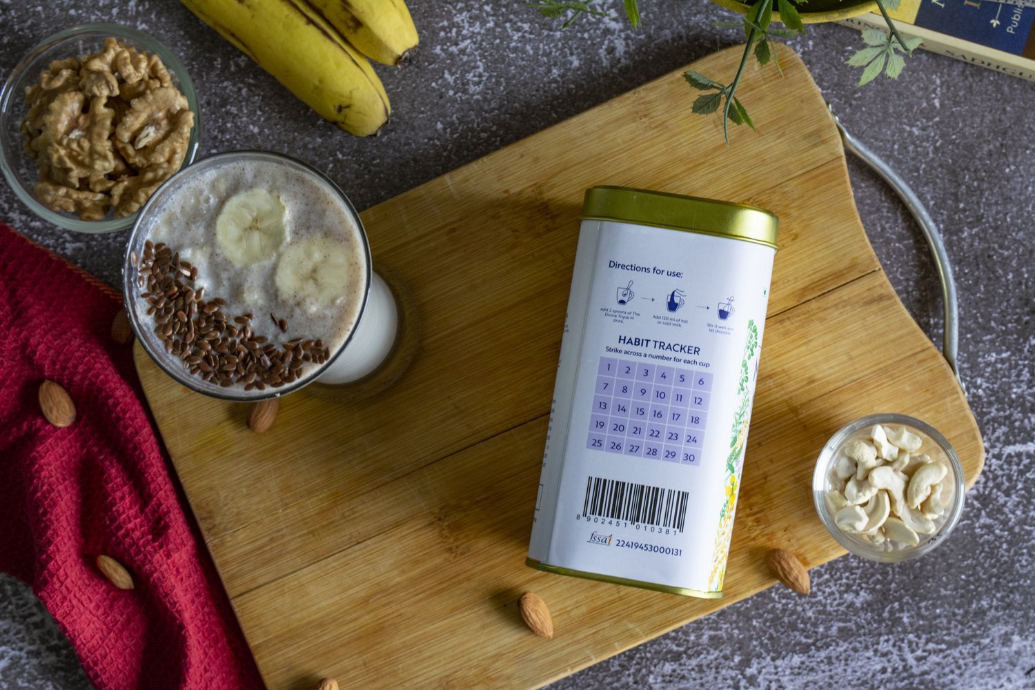
Conveying tradition and fair-trade through handpainted illustrations
The brand’s main focus is being a bridge between the farmers who procure the product from the Earth and delivering it to the doorstep of consumers.
One of the best ways to project the same would be to illustrate the product and that watercolor would be the best medium to add a personal as well as a natural touch to the illustrations.
Typography
I wanted to stand out from the competitors by going with a sans-serif typeface for a brand that talks about tradition and nature.
I identified a weight that is subtle, complementing the purity of the product.
Since I did not want to use multiple typefaces for the brand and was not happy with the brand identity’s tall typeface (which is imposing and loud), I had to pick a typeface that will also visually support the tall identity font.
Conclusion
In a world that is powered by social media, the definition of packaging design has definitely altered. With e-commerce becoming a prominent POS, it is important to direct packaging design that appeals to a wide range of audience, eventually leading to conversions. Another learning from the project is that there has been an increase in the number of brands and organizations dealing with natural and traditional food products. There is a need to fight for attention and stand out, all while divulging the values of fair-trade, natural and traditional ingredients and recipes. Picking out a typeface that is both unique and scalable to suit the various products and at the same time remain modern- catering to the millennial audience. The project has been a step ahead in terms of learning and keeping up with the ever-changing attitude of packaging design.