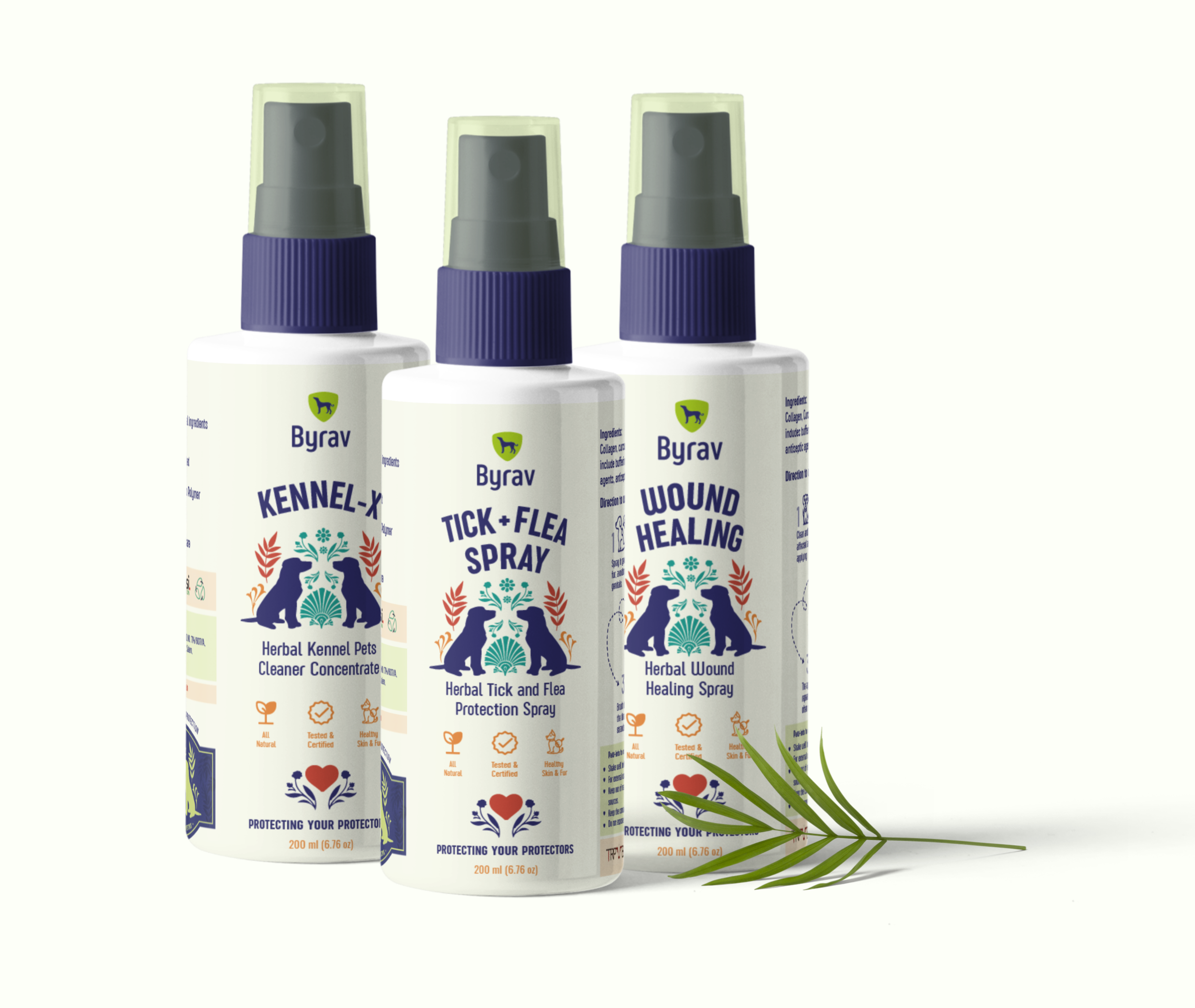
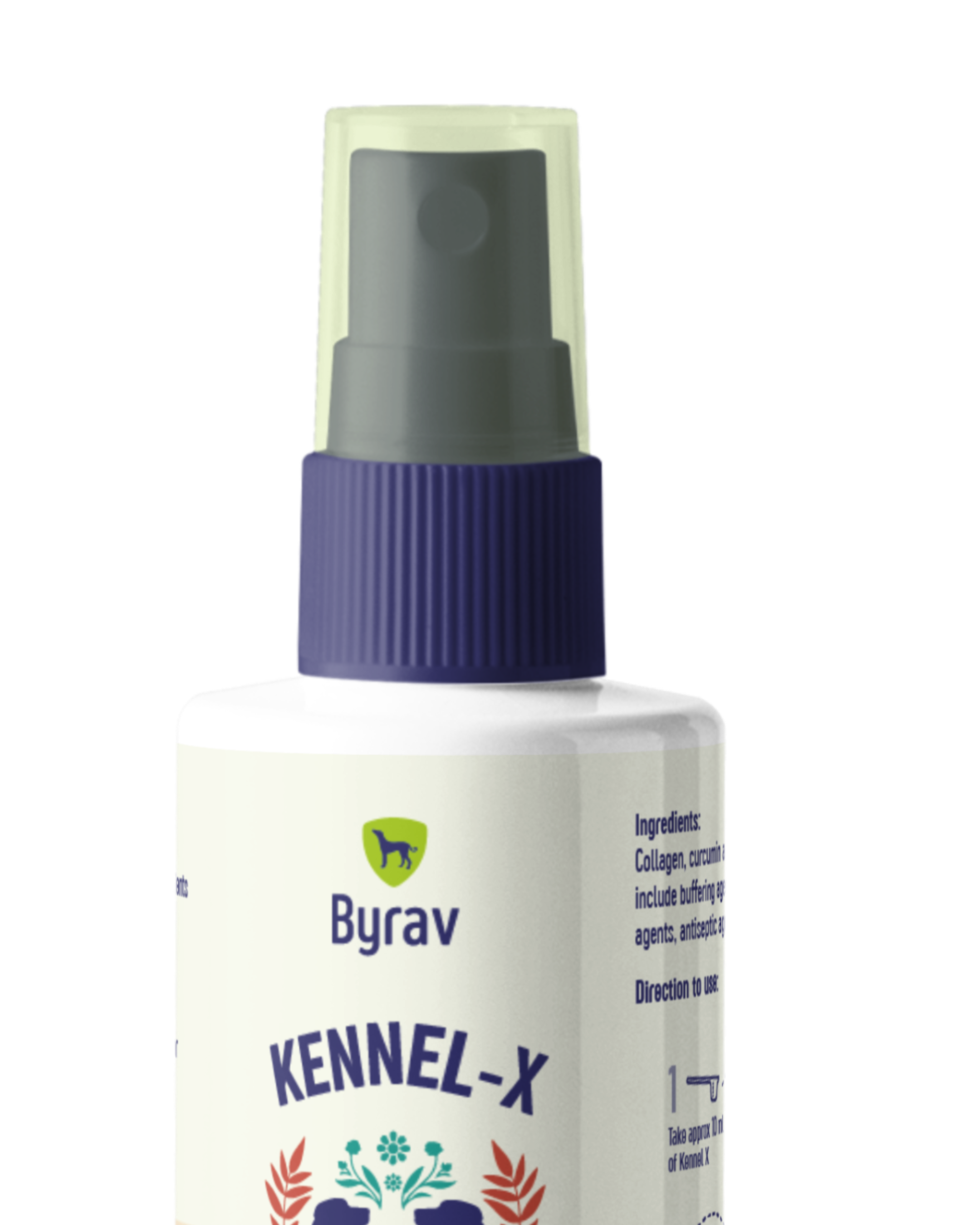
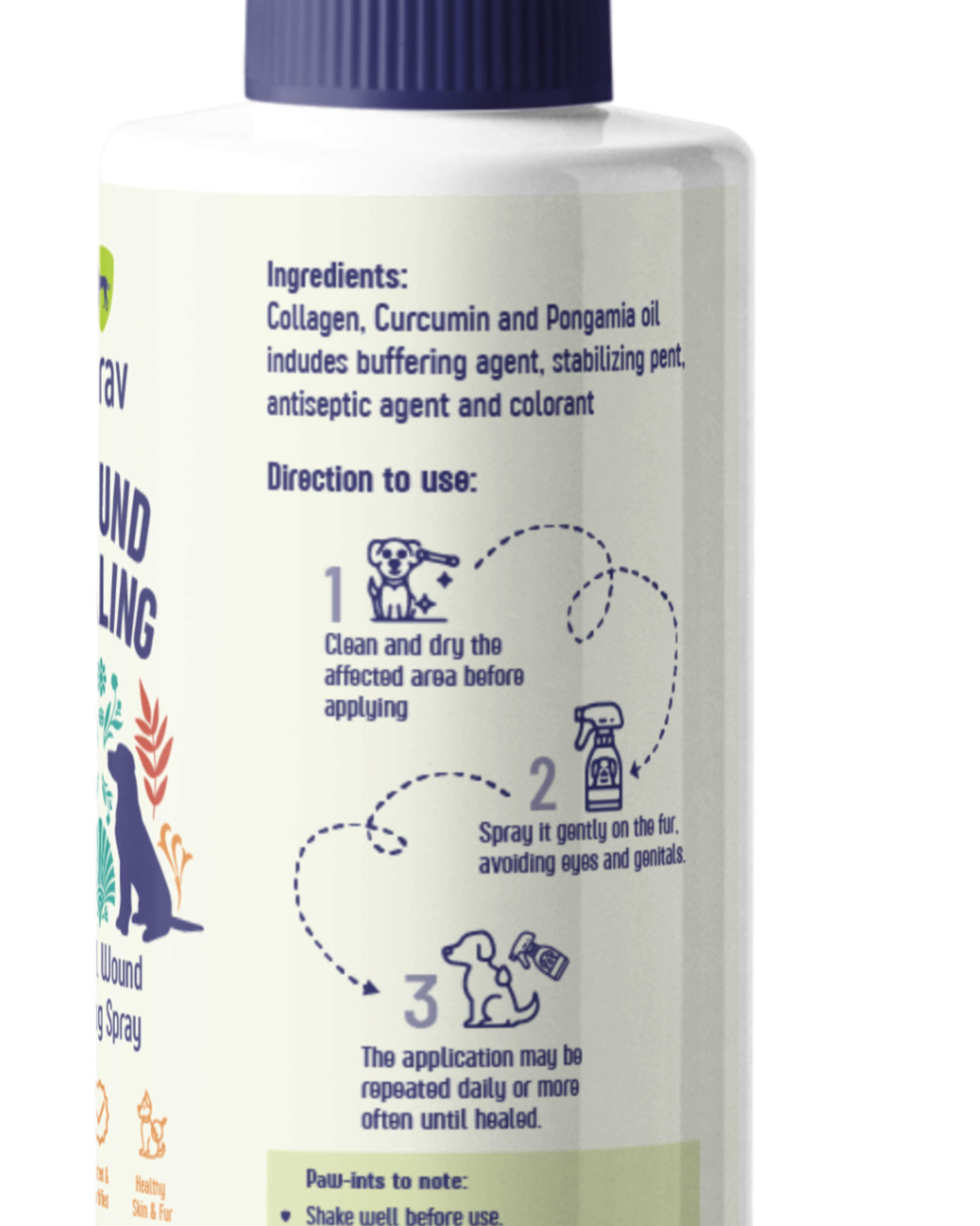
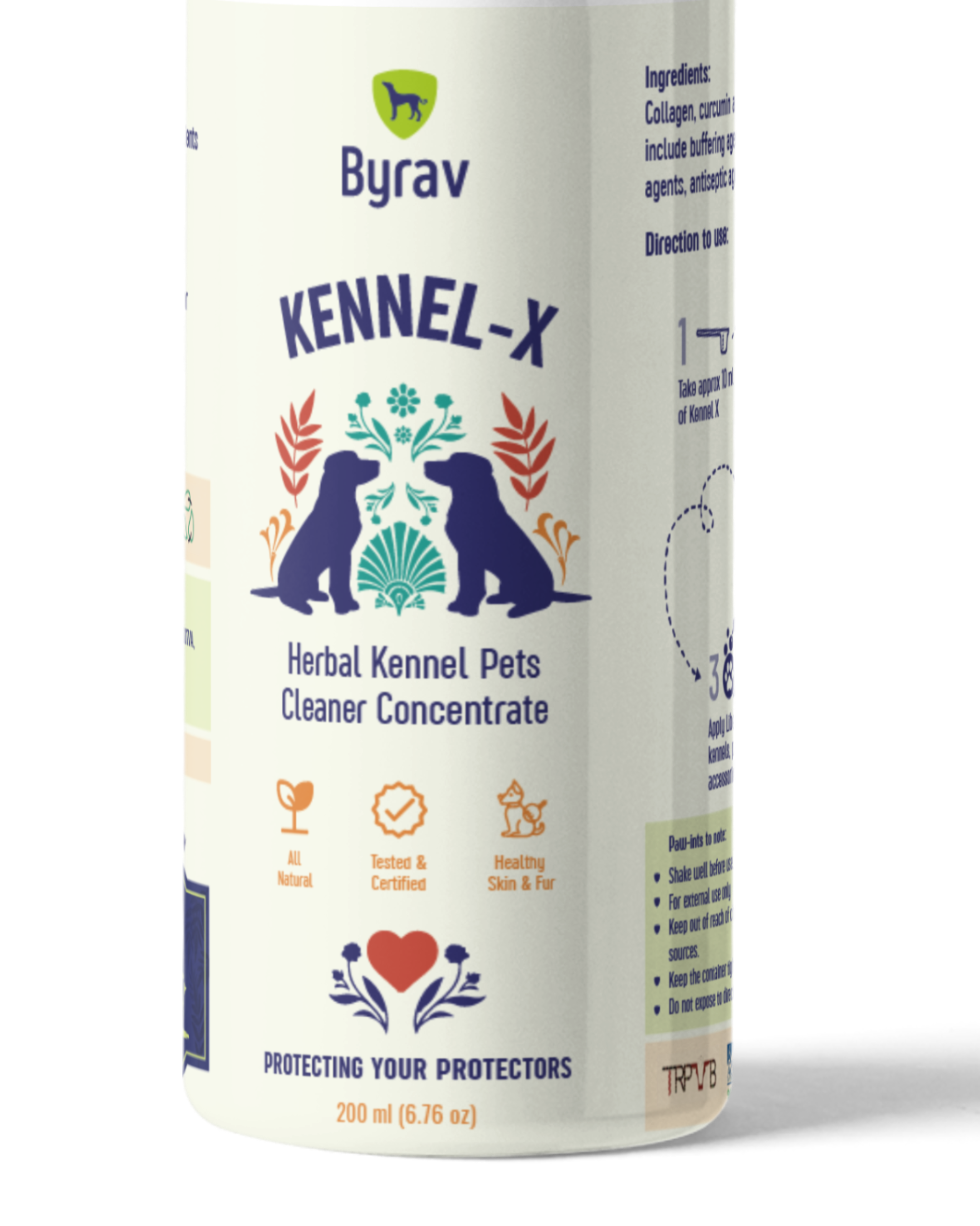
Byrav: Dog Care Line
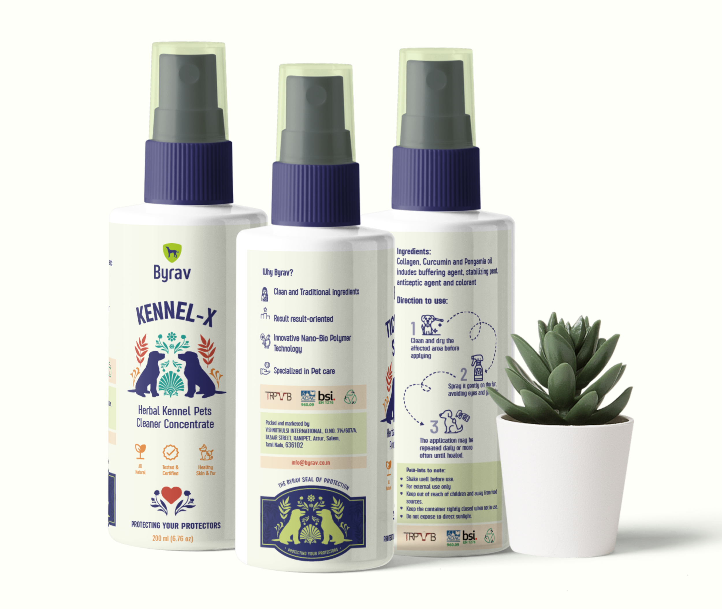
Protecting your protectors: Branding a dog care brand made for the wellness and protection of native breeds. Not your usual cute pets. Byrav is for the fierce and the brave ones.
About
The founder came to me with a radical idea of creating a homegrown brand to cater to native Indian breeds. The concept was so interesting that the project’s thought process was completely unique from the ones I have used before. A dog care brand that doesn’t use doodles or smiles or bubbles. The branding and language had to be something that is bold, powerful, and prideful.
Branding Process
Competitor Analysis
A detailed competitor analysis was carried out to understand how other adjacent players in the market did their branding. Discovered a few interesting brands- one brand only developed products by using ingredients in the Himalayan region. Another brand developed products that were probiotic-based. A brand markets its products in such a way that they urge the buyer to ‘join a movement to a cleaner world’.
Brand Positioning
This helped in evaluating where one can position Byrav. The positioning statement developed was: Byrav is a brand for dog owners who want Traditional and nature-backed solutions for their dogs and need to keep their dogs safe with clean simple recipes but are swamped with irrelevant options. Byrav provides dog care products to help customers overcome synthetic and unhealthy dog care products and achieve a worry-free and safe line of products for their pets.
Value Proposition
The positioning statement and an analysis of value maps, pain points, gains, and customer profiles, helped in creating the value proposition for Byrav:
Our brand helps dog owners who want to care for their pets and protect them by using traditional recipes and trustworthy dog care products unlike the many available in the market.
Brand Messaging
One-liners were developed for the brand. The exercise began with building a brand story. followed by developing the brand pillar statements. This helped build persona messages and eventually the product specific statements.
Visual Branding
With the messaging and value proposition for the brand in place, I developed a word cloud that could help me derive a direction to build the visual identity for the brand.
The terms picked out after conversing with the client for a better understanding of their audience was Tradition, Protection and Legacy. Followed by Healthy, happy dogs, Native Indian dogs, powerful, pride, villages, trustworthy and safe.
Competitor analysis was done on brands that were working on products in the dog personal care section. Some of the key findings that helped set objectives for the visual direction of Byrav is as follows:
Typography Based Identities
Many dog care brands had fancy names which meant they were to be emphasised through a typography based identity.
Dog or paw illustration
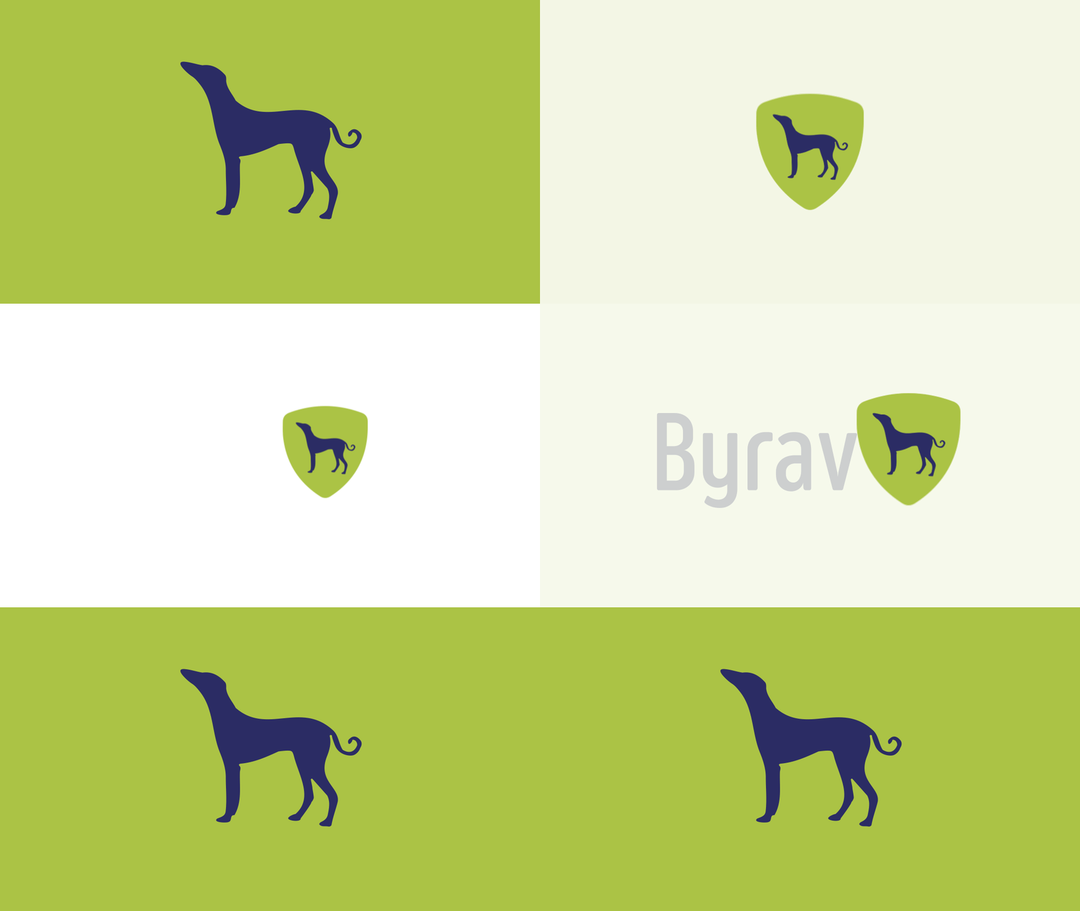
A dog or paw illustration was pivotal in all identites that were researched. This led to some identities being non-responsive and heavy on the eyes.
Colors
Many brands and their identities were warm, earthy tones like brown. Hence, Byrav’s branding can opt for something more vibrant.
The Beauty of AI
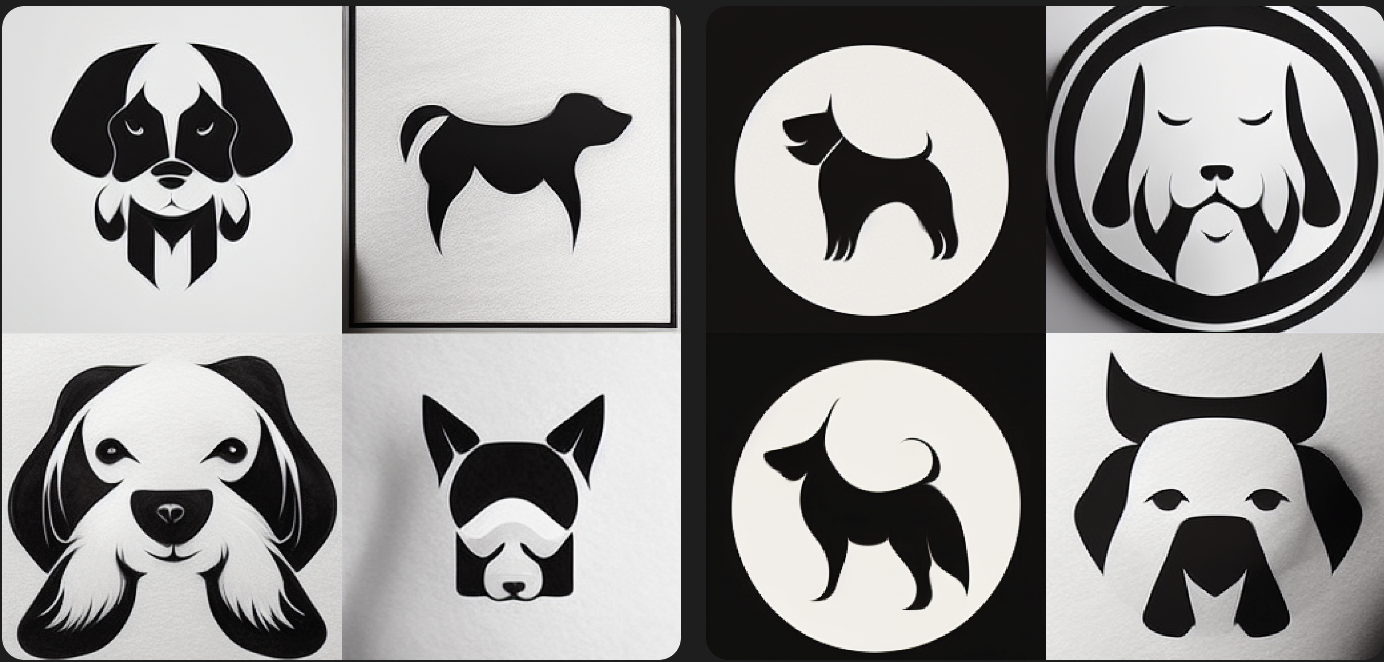
During the identity creation step, I took the liberty of running some of my ideas on Dall.E as well as Midjourney Ai for illustrations and conceptualizing the ideas that I had!
Typography
The identity’s typography style was picked out to emit a sense of strength and pride. The concept of protection was translated with picking out a typeface that has a higher weight and minimally-curved ascenders and descenders. Although I picked out a sans-serif typeface, I wanted to emote the idea of traditional recipes by keeping the finials curved and more characteristic. The font also has an extensive range of weights which can be used as a brand font since the brand does not have a secondary typeface.
Colors
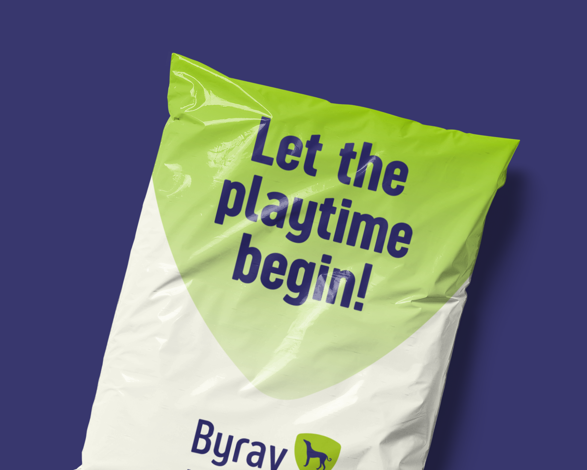
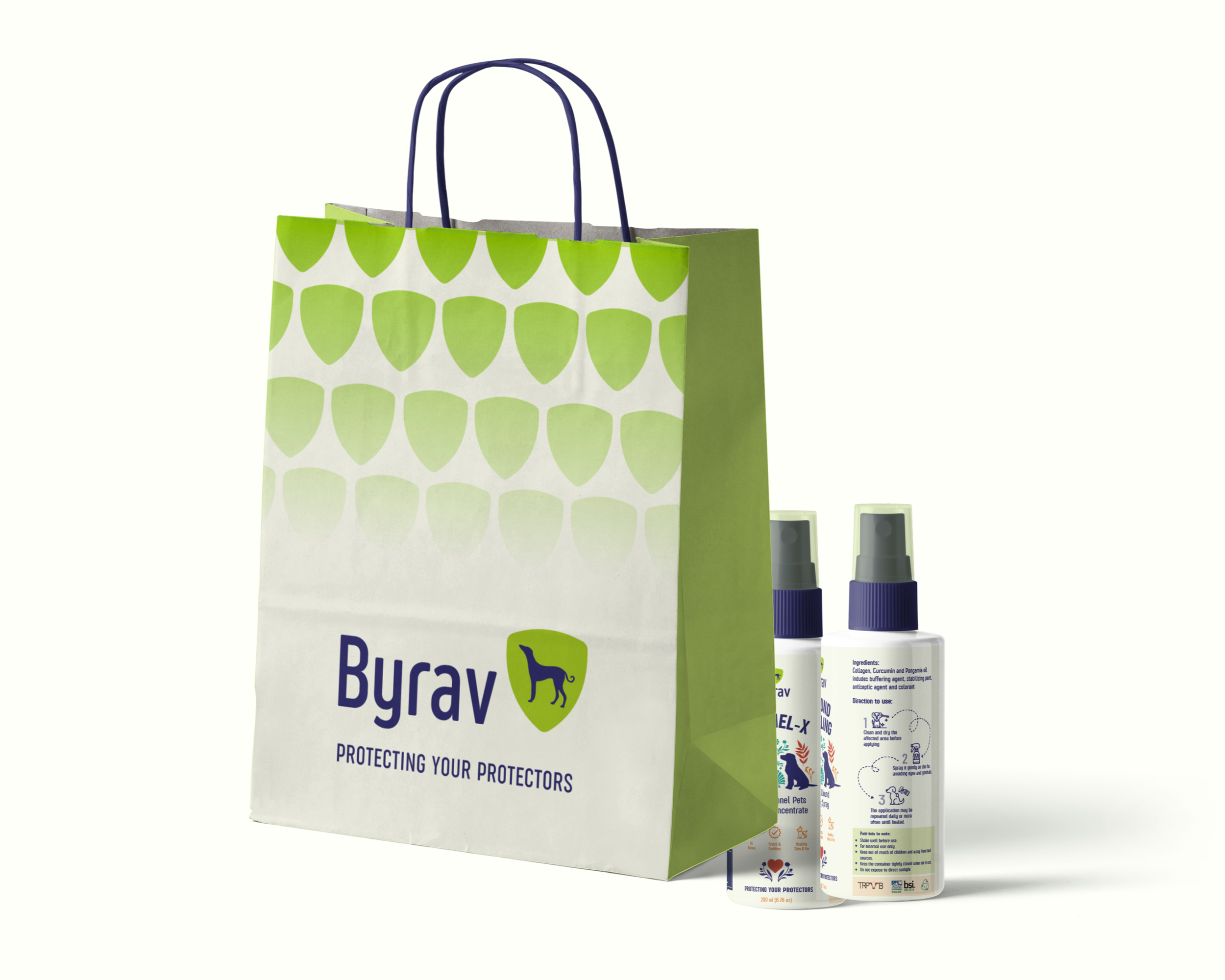
Since the competitor analysis already indicated that blues, purples and greens were opportunity areas for the brand, explorations were done in these hues alone. The client picked out the Space Cadet shade contrasted with an Android Green. An extensive secondary and tertiary colour palette was designed to give freedom and flexibility to the brand language as it is a newer and emerging brand.
Conclusion
The creation of Byrav's brand identity represented a unique challenge: to craft a bold, powerful, and prideful image for a dog care brand, diverging from the industry's standard use of playful doodles and imagery. This endeavor began with an in-depth competitor analysis and strategic brand positioning, identifying Byrav's unique niche in providing traditional, trustworthy dog care products. The development of the brand's messaging was a critical step in this process, where we crafted a narrative that resonated with dog owners seeking safe, synthetic-free alternatives for their pets, anchored by a value proposition that highlighted traditional recipes and trustworthy products.
In the visual branding phase, the use of innovative tools like Dall.E and Midjourney AI played a significant role in conceptualizing and bringing to life the brand's identity. The selection of typography and colors was meticulously done to align with the brand's ethos of strength, tradition, and trust. The chosen typography emitted a sense of strength and pride, while the unique color palette, featuring Space Cadet and Android Green, distinguished Byrav in the market. This strategic approach resulted in a distinctive visual identity that not only sets Byrav apart in the competitive pet care market but also authentically represents its commitment to traditional wisdom and safety in pet care. As Byrav continues to grow, its brand identity is poised to resonate deeply with pet owners who value quality and authenticity for their beloved pets.
